
Before we talk about “7 Quality Efficient Project Management Tools”, let’s talk about Project Management.
Project management is the process of effective planning, scheduling, and conducting projects to achieve desired goals. It involves technical skills, resources, people, money, materials, and methods.
Project management is an important part of every business organization, and its success depends on the ability to make sure that every project is delivered on time and within budget. Project managers can use various tools to manage their projects effectively. These tools help them monitor the progress of their projects to make changes if necessary.
Good project management is fundamental to any business environment, and it is a process that is not learned overnight. To help you get to grips with it, I’ve compiled a list of “7 Quality Efficient Project Management Tools” that can get even the most chaotic projects organized in a breeze.
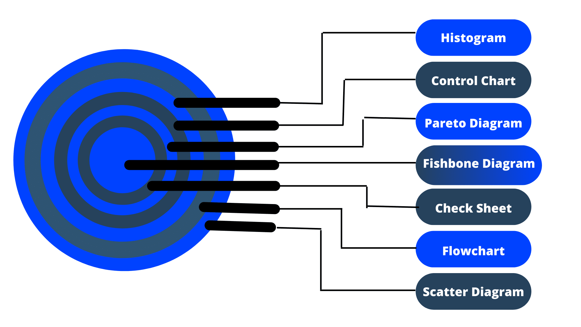
7 Quality Efficient Project Management Tools
- Histogram
- Control Chart
- Pareto Diagram
- Fishbone Diagram
- Check Sheet
- Flowchart
- Scatter Diagram
1. Histograms
Histograms can be created using Microsoft Excel, but they may require some manipulation with formulas and functions to appear correctly.
In project management, histograms determine the distribution of tasks in projects. The task distribution can help you manage your project more effectively by looking at how much time is spent on each task.
Histograms Pros:
- It shows the amount of time taken for different tasks in a project.
- It helps identify bottlenecks in a project by showing which tasks take more time than others.
- It helps identify issues with the schedule by showing whether tasks are too long or too short or if resources are over-allocated or under-allocated
- It provides clear visualizations that allow you to spot trends and patterns easily.
Histograms Cons:
- Histograms take up more space than other types of charts
- If there is missing data, then it may not give an accurate representation of what’s going on with your distribution
2. Control Chat
In the project management process, control charts are used to monitor the performance of a project over time. It helps to determine if the project is on track or not.
Control Chat Pros
- Control Charts help you identify potential problems with your project early on.
- Help you determine if your project is stable or not.
- Provide continuous feedback about your project’s performance over time, so you can make adjustments when needed.
Control Chat Cons:
- If there is no variation in performance between tasks or activities, it will be tough to spot any issues on the chart because everything will look like it’s going according to plan!
3. Pareto Principle
The Pareto Principle helps identify which areas need your attention most and where you should spend more time and resources. It’s also a good way for you to prioritize tasks within your project plan based on their relative importance (e.g., high-priority tasks are performed sooner than low-priority ones).
Pareto Principle Pros:
- Focuses on what matters most; avoids wasting time on low-priority issues.
- It helps identify root causes or significant contributors that can be addressed with a simple solution.
Pareto Principle Cons:
- The Pareto Principle doesn’t always apply because it’s based on averages and may not accurately represent all situations or conditions.
4. Root Cause Analysis
Root Cause Analysis is a popular tool used by project managers to identify the root cause(s) of a problem or issue. It’s also known as Fishbone or Ishikawa diagram. The main goal of this method is to get more information about the nature of the problem by asking “why?” in different directions.
Root Cause Analysis Pros:
- It helps identify multiple root causes at once
- Lists all potential causes in one place, so you don’t miss anything
- It helps focus on high-risk areas first
Root Cause Analysis Cons:
- It takes time to complete correctly (but not as long as other methods)
5. Check Sheet
Check sheets are used to give project managers a quick view of the status of their projects. It can be used for both fixed-price and cost-plus projects. They also allow managers to quickly see how much work is left to be done on each task and how much money is left in the budget.
Check Sheet Pros:
- Quickly assesses project status
- Check sheets are easy to use and can be customized to fit your needs
- It keeps track of specific tasks or activities that need to be completed during a project.
Check Sheet Cons:
- It doesn’t give detailed information about each task or resource
- It relays on a Pareto chart or histogram.
6. Flow Chart
Flow charts are one of the most basic and common tools used in project management. It uses to break down complex processes into smaller, more manageable chunks.
Flow Chart Pros
- Visual representation of a process or procedure makes it easier to understand.
- It helps all stakeholders stay on track with their tasks throughout the project lifecycle – from start to finish.
Flow Chart Cons:
- Creating a flowchart can be time-consuming if there are many steps involved in a process, and each step needs detailed analysis before creating a flowchart.
7. Scatter Diagrams
Scatter diagrams are very helpful in project management because they help you see the relationship between two different variables. It can be used to determine if there is a relationship between two variables or not. If there is no correlation, then it means that one variable does not affect the other. On the other hand, if there is a significant correlation, then it means that one variable affects another and vice versa.
Scatter Diagrams Pros
- It helps you identify trends in your data sets.
- It provides an easy way to compare multiple data sets at once
- You can see relationships between different variables and make decisions based on those relationships.
Scatter Diagrams Cons:
Scatter charts can be challenging to interpret because they don’t tell you what happened before or after each point on the graph (unless you create additional axes).